In the best tradition of great artists, John Chiara creates art that makes the old and familiar seem fresh, new and alive with possibilities and wonder. For his latest series of one-of-a-kind mural-size photographs of New York City, he designed and built a giant camera that barely fits in the bed of a large rental pickup truck. Always looking up toward the skyline, he scouts through the city for the right combination of iconic architecture, perfect light and shadows, and surprising bits of pleasing chaos in the foreground.
This latest homemade camera looks like a large wooden crate with a big round lens on one side. Inside the camera body, a single large, irregular shape of photographic paper will register the image directly – there is no film involved. And since the photo paper was originally intended to invert an image from a film negative into a positive image, in this direct action, the final image is captured in negative colors. It’s not what your eye sees at all. The results are magical: large 40 x 50 prints with highly saturated color like glowing alien liquid light, with familiar buildings and places all captured at odd angles and weird juxtapositions, and occasional blurred movements that look like the ghosts of flying birds or light that somehow leaked into the camera from the edges.
In what is quite possibly the most photographed city in the world, it’s delightful to encounter so many familiar views that challenge you to look at them again and to see them with new eyes.
This work will be shown at Yossi Milo Gallery from September 6 to October 27, 2018. If you get a chance, take the opportunity to appreciate these luscious works of art in person – the exhibition promises to be a completely immersive experience designed to energize your eyes and heighten your appreciation of this great city.
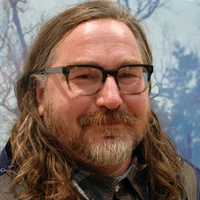
Following up a great conversation we had in Paris last fall, I spoke with Chiara via Skype at his studio in San Francisco the week before the exhibition was set to open in New York. Below is an edited version of our conversation.
— Jim Casper
LensCulture: I was thinking to myself about what I liked so much about the negative color in your work. Aside from the colors being so luscious and unexpected and different, I like that I can look at something that might be really familiar — like these city scenes from New York — but see them with completely new eyes. It makes me notice lots more details in a picture because I’m forced to really try to unpack them to figure out what’s going on in each image.
John Chiara: I’m really glad to hear that, because that is the whole point of doing it.
LC: So tell me a little bit about the new work from New York. What was the idea?
JC: It’s a challenge to photograph there because it’s been photographed so much, but I like that challenge. I’m trying to refresh the senses of something that’s been seen so many times like a street corner, or yeah, the skyline, the verticality of the landscape there.
And for this show, I just sort of went for it: lots of images in a consistent large format, all with the negative color.
I’m kind of excited to do it that way this time because I normally mix it up [regular color and negative color], but I think it’ll be interesting not to have that switching back and forth happen, not breaking that at all and just have it all be the negative images, because then I think the viewer might get into that world and not have it broken. You know what I mean?
LC: I think it’s a great idea. Just make it very immersive, almost like you’re under water looking at things in a whole different way.
JC: Yeah, and to make this new work, we built a new 50 x 40 camera with a great old Goerz 70-inch Artar lens. These are big barrel lenses that were designed for very specific sort of purpose. They have a very flat field and they’re built to enlarge things, and they don’t have a lot of distortion. With its 70-inch focal length, it captures a wide image circle. So we built out the camera to cover the 70 inches, and that’s pretty much what I’ve used the majority of the show. It has this hyper clarity to it. I built a small aperture for it so that everything’s very sharp. Yeah, I’m really happy.

We built the camera here [in San Francisco], and then shipped it there. I’ve been renting a commercial pick-up truck because I find that if you have a commercial pick-up truck, you can just get away with a lot more because New York is still very much a working man’s or working person’s city where if you’re working and if you’re clearly moving something around, people just drive by and they just move out of the way, because everybody’s just like, “Oh, those people are moving something like everyone else in the city.”
LC: How did you choose what and where you wanted to shoot? Did you look at historical photos and try to do a different take on what had been done before, or what were your criteria?
JC: Well, I didn’t really look at many historical photos, but I know them of course. We did look at some Berenice Abbott work, her work on the skyline and the changing skyline during shooting. Definitely what’s in my memory or my collective photographic memory of New York is the work of Steichen. I always think about these wonderful gum bichromate prints that he did that have these really intense blues and greens. They’re not intense in their color, but there’s something about the hue of them. They’re very sort of dark and brooding. He’s always kind of in my mind when I’m out shooting, I think. They’re just so New York, those pictures that he took. And they’re so gothic.
LC: So, do walk through each neighborhood looking for a place to shoot? Are you always scouting, always trying to eyeball things that would make an interesting picture?
JC: Definitely when I’m walking around it’s a lot easier to see it because then you have a lot more time to look up and look around. So when I’m walking, it really helps, but a lot of it was me driving around and just sort of trying to find pictures. We spent a lot of time scouting. We spent all day every day just driving around New York City, which, I know to some people sounds stressful or nightmarish because you’re just stuck in traffic most of the time, but when you don’t have anywhere to be, it’s really pleasurable. Even if you’re caught in traffic and people are cutting you off, you get used to it and then it becomes this sort of hunt. The only time I ever got frustrated was if I had to be somewhere in particular at a particular time. That happened a little bit because after a while, you know what you’re trying to accomplish and then you are trying to get somewhere at very particular time to take a very particular picture.
LC: Because of the way the light is coming in?
JC: Yeah, near the end, the last week I was really just trying to accomplish one thing and it was in a really intense part of town on West 43rd and 5th avenue, which is right by Grand Central, and I was trying to take these pictures and make this diptych from basically the corner where the crosswalk is on 5th avenue where you’re not allowed to park. But it had to be at a very particular time. Near the end I was kind of photographing the same things over and over trying to get them just how I wanted them.
LC:That’s interesting because I didn’t know if you did that, if you went back to the same place and shot again and again, but it sounds like you do.
JC: That’s all I do. I go back to the same places all the time. Years later I’ll go back when I feel like I’m going to bring something else to it, then I can go back and I’ll photograph at the same places, but usually you won’t be able to tell that it’s the same place. Once I get the picture the way I want it, exactly, then I will stop taking pictures of that location.

LC: I really like when the unexpected thing seems to fly into your pictures. There’s one image you made on Trinity Place near Rector Street, where it looks like something just flew in front of the camera. Do you remember that one?
JC: Yes! That’s light coming in through the bottom of the film back. Sometimes, purposely, I don’t put the film back all the way in, and then we’ll open it up and then tap it in. But it’s this really brief thing because that paper is really sensitive to light, so it’s like this thing where you can’t really … It has to be very quick otherwise it’ll all just turn black and red. But yeah, it catches that fleeting moment where light can kind of shoot around in there.
LC: So you’re really rolling the dice with that kind of thing.
JC: Yeah.
LC: It’s a great effect. You talked to me a little bit about scale and you said for this exhibition they’re all roughly the same size and same orientation, the diptychs or the vertical ones, but can you talk a little bit about size and scale, and why that’s your favorite? Does it not work when it’s smaller?
JC: I don’t think it works. I mean, it works … The last show we had a lot of 34 x 28 images and they work, but I feel like negatives, these inverted images have to be bigger. I feel like Ilfochrome can be 4 x 5 and it’s intimate and it could feel sort of personal and intimate, sort of like it’s yours. Ilfochrome or black and white can work in a smaller size, but these color negatives, I don’t feel like they work at smaller sizes, I feel like they have to be really big. They have to be really graphic for you to connect with them as much. I just feel like they have to be expansive or super over the top. I don’t know how to explain it, but they need to be bigger. That’s one thing I’ve realized. They need to be around the size of 50 x 40.
LC: I think especially with the negative color and the richness of the way that the color is on the paper, it has a pop art feel to me a little bit, too. Does that ring any bells?
JC: On screen, I think like they feel more illustrative and more poppy. In person, they feel more graphic but they still have that inherent photographic image quality to them, whereas on screen, they’re kind of in this realm of illustration/photograph, you’re not really sure. But in person, because of the qualities of the paper and everything, it’s clearly a photograph. So it reads a little different in person … and it’s more saturated.

LC: I think that’s probably one of the many reasons why they’re just so attractive, too, is because they are clearly photographic but it’s just not the way your eye sees. It’s like you have to do these mental gymnastics, I think, when you’re encountering your work. It’s really a delightful experience. It’s fun to just kind of puzzle through it and to soak up the detail like that.
JC: Oh, nice. Thank you.
LC: Can you tell me why you choose not to have people in the photos?
JC: The photos read differently to me when there are people in them. I think partially because when there are people in them, it kind of becomes about them, it becomes about the people, and they become much more objective as far as a picture goes. When there are no people, it feels more subjective. It feels like you could take it and own it as a viewer, it becomes yours in a sense, where it becomes more part of something that you can believe might come out of your past or your memory, you can engage with it in a different way, I think.
LC: I think of New York architecture and buildings as if they’re well-known celebrities or icons. Were there any particular places that allowed you to get an especially new take on one of those old icons?
JC: I was really happy with the UN picture I took. The UN building is such a challenge because it’s so geometric in an uninteresting way. The UN building is one of my favorite buildings. From the side of it, it’s incredibly beautiful because the side is textured with what looks to be granite or something. When you see it from the side, you don’t know what it is, and then you turn a corner and you see that it’s this really, really long building. I wanted to photograph it for a long time, and I finally captured it through this burst of trees and there’s also a lot of this light moving in through the top of the film back that’s just sort of obstructing the view. But there’s enough of the building in there that you know it’s the UN building. So if you’ve ever seen the UN building, there’s enough of it so that it clearly registers.
I’m also really happy with the diptych of the new Whitney building, which kind of looks like a battleship. I shot it from one angle at an extreme angle, and then I went to the other side of the building and shot the front façade from this other angle. So when they’re inverted, they make sense, but it’s very Cubist in a way. I was really proud of that because I felt like it enhanced the qualities of the building that already has these really intense geometric shapes, and the way the light was hitting the building with all this glare, and it was just … I don’t know. It’s nice.
I feel like the buildings that really speak to me most, resonate as New York, are more like the Rockefeller Center. I took the side of the Rockefeller Center and the graphic qualities accentuate the verticality of it. I think that’s one where I felt like, okay, yeah, this feels so much like New York.
LC: So, tell me what’s next for you? I know you’ve done California, and you have made a lot of work in Mississippi, and now this series from New York.
JC: I’m still photographing in Mississippi, and I’ll eventually want to make a book of the Mississippi work and a book about New York.
LC: That’s a pretty nice range of Americana there.
JC: Which is nice. And I still want to photograph in Budapest. I’ve been photographing there, although I haven’t really shown any of that work yet. I’m hoping I get a chance to go back there. It’s a really intense and interesting mix of architecture.
I feel like it’s the second time you go back to a place when you really get it. So you go photograph it for a month and a half, and then you develop all the work, spend some time with it, you think about the place. You can’t just go someplace once. You got to go there, photograph there, and then you got to think about it and then go back.
Editor’s note: If you like this work, be sure to check out John Chiara’s earlier work from California in this article in LensCulture. And don’t miss the exhibition at Yossi Milo Gallery in New York from September 6 - October 27, 2018.